
The Art of the Colorful, Custom Frames
When most people think about custom framing, they picture the classics: black, white, natural wood, or perhaps a brushed gold or silver frame. Those timeless choices have earned their place, and they’ll never go out of style.
But sometimes the perfect frame isn’t the one that blends in.
Sometimes it’s metallic pink gingham!
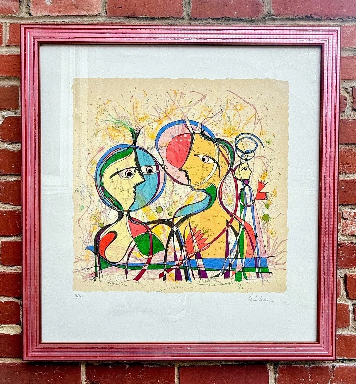
Or ceramic blue.
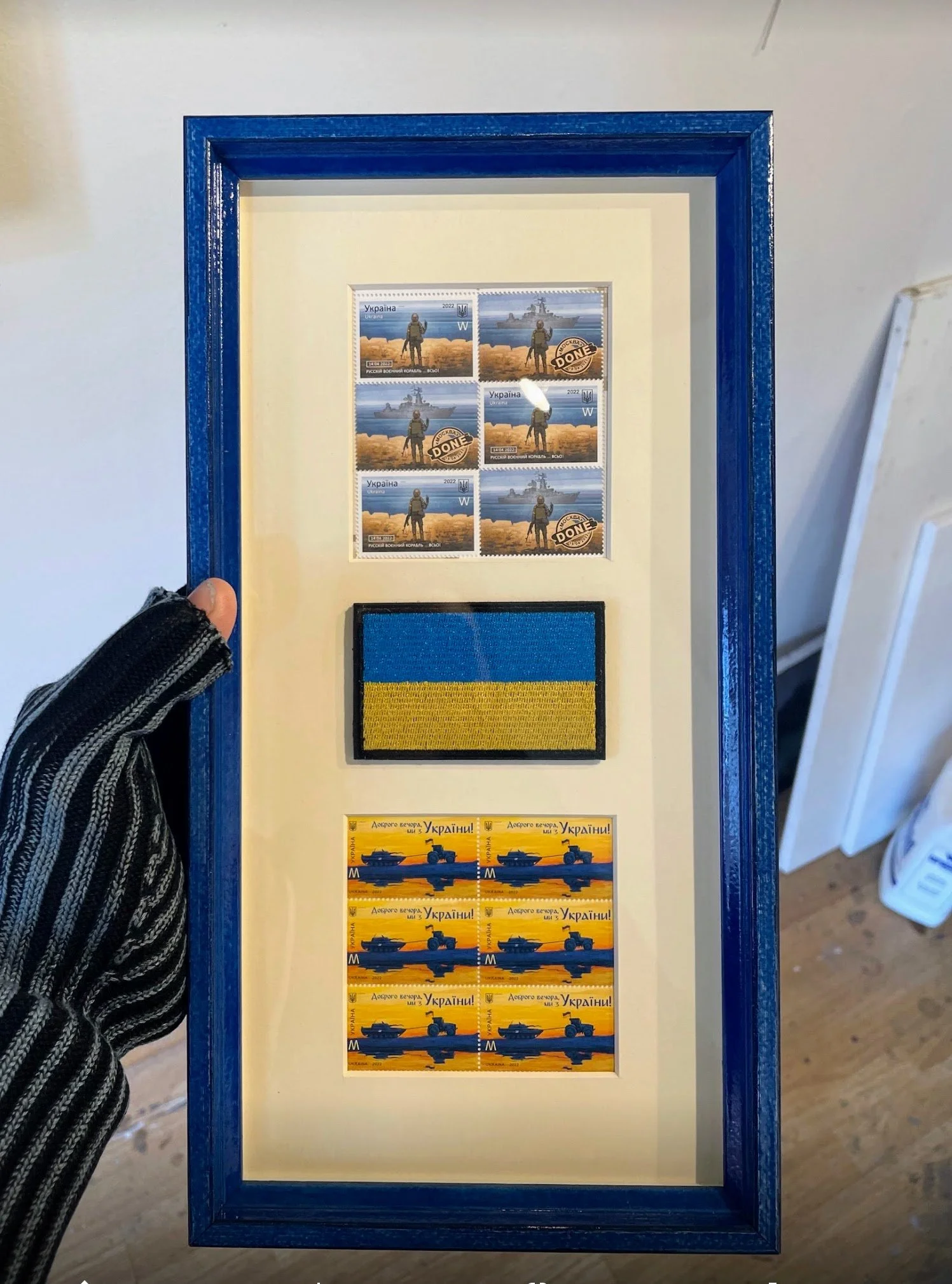
Or a rich lacquered red and black Marquetry.
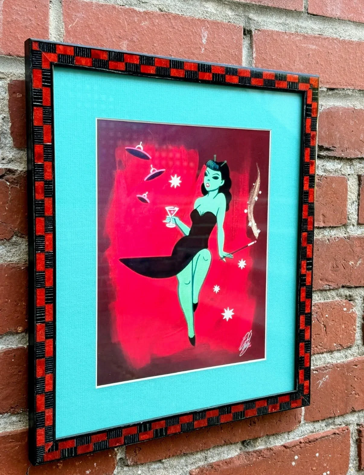
For many people, colorful frames feel like something reserved for children’s artwork or whimsical spaces. We see them differently. Color is one of the most powerful design tools in custom picture framing, capable of transforming not only the artwork, but the entire room.
The secret is to let the artwork lead the conversation.
Instead of asking, What color frame do I like? ask, What colors are already living inside this piece? You may discover a soft blush tucked into the background of a painting, a vibrant turquoise hidden in a brushstroke, or a warm crimson that suddenly comes alive when echoed in the frame. The goal isn’t to match the artwork exactly. It’s to create a relationship between the art and the frame that feels natural, intentional, and a little unexpected.
We often think of a frame as something that simply surrounds the art. Instead, think of it the way you would a favorite chair, a beautiful light fixture, or the front door of your home. In great interior design, every detail contributes to the overall experience. A frame can quietly disappear, or it can become part of the story.
One of the joys of custom framing is that there are no rules saying every frame in your home has to match. In fact, some of the most beautiful homes in Old Town Alexandria embrace variety. Historic architecture, contemporary art, family heirlooms, travel photography, and original paintings all coexist beautifully because each piece has been framed for its own personality rather than forced into the same formula.
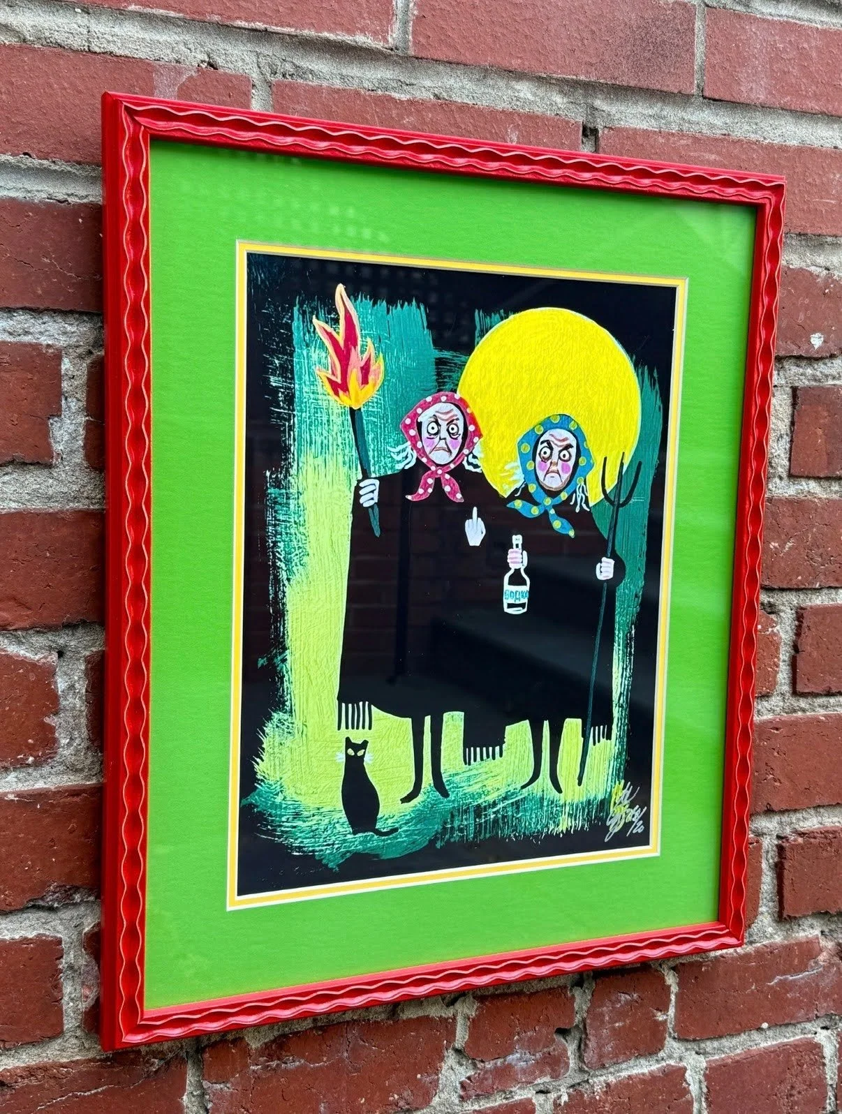
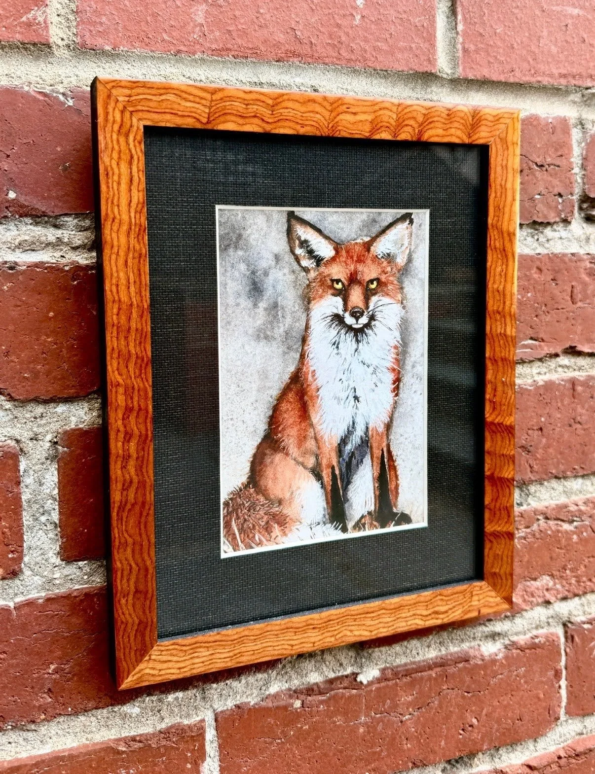
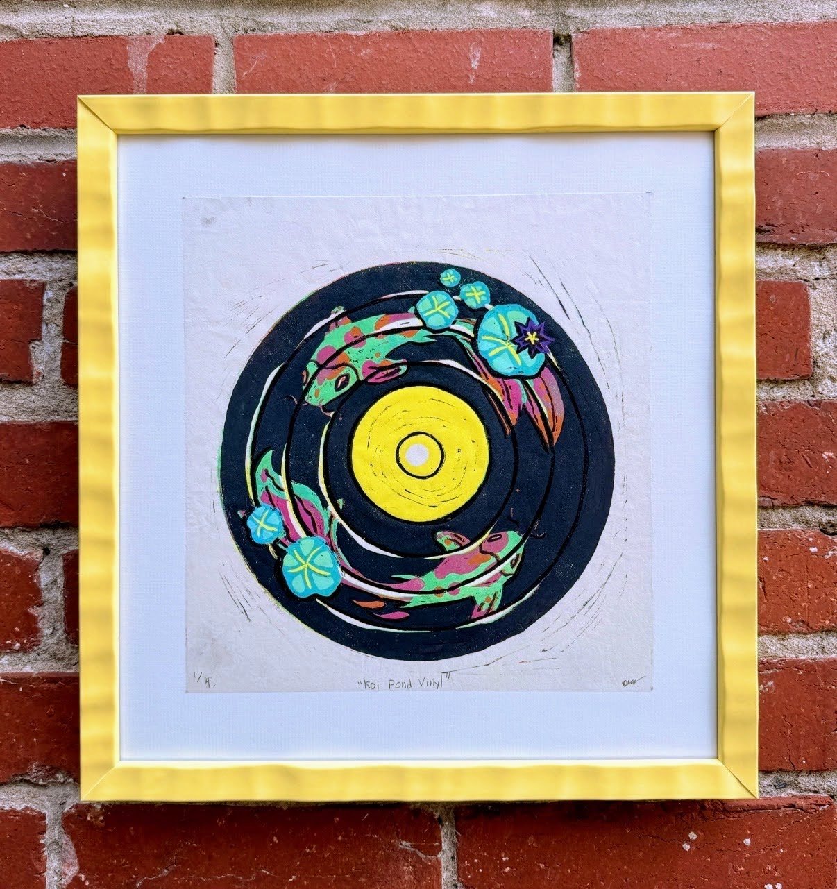
That’s exactly how we approach framing. Every piece deserves its own conversation. A contemporary print may call for a vibrant lacquered frame. A wildlife watercolor may feel most at home surrounded by richly figured wood. A vintage poster might come alive with an unexpected pop of color that ties everything together.
The best part of our work is watching someone’s expression change when they see an option they never would have chosen themselves. More often than not, it’s the colorful one.
Not because it’s bold for the sake of being bold.
Because it simply feels right.
So the next time you’re choosing a frame, don’t feel obligated to reach for black, white, or walnut. Explore the colors already hiding within the artwork. Have a little fun. Your frame doesn’t have to disappear into the background to be timeless.
Sometimes the most memorable rooms are the ones that aren’t afraid of a little personality.
After all, great art framing isn’t just about preserving what you love. It’s about celebrating it.
SEE ALSO: Beneath the Waning Moon