5 Design Tricks To Make Small Spaces Feel Larger
Alexandria homes are known for their historic, quaint character, but the flip side of all that charm can mean small, idiosyncratic spaces that are challenging to make work for modern living. Having helped lots of clients make the most of their small spaces, we thought we'd share how we used our design tricks to help a busy Old Town family with two young children...and no, you don't have to take down walls!
1) Hang curtains high
 Much like in fashion we hear about "extending the leg line" by pairing high-waisted pants with heels in the same colorway, hanging curtains high draws the eye up. By accentuating the vertical line, walls seem taller and the space feels more open.
2) Use large area rugs
 Similarly, by using a large area rug that extends nearly to the baseboards, the footprint of the space feels larger. We opted for a neutral rug with a repeating pattern to add interest and movement, while staying within a unifying, tonal colorway. This eliminates the barrier between floor and wall; the fewer barriers, the more easily the eye moves, the more expansive a space feels.It is interesting to note that the opposite holds true. When trying to define a space that is too large, we seek to impose visual "stops." Rugs instead are sized to lay a foot -- or even more -- from the baseboards, thus providing a break. We can even add a generous border and/or use a bolder patterned rug to better articulate the area.
3) Add color...but with care
 Adding color is a great way to keep the eye moving, but it is important to do so thoughtfully by keeping the palette narrow. Here, our clients loved a fresh, happy color story in serene shades of green; the eye travels in a pleasing manner from the botanical pattern in the drapery to the leaf motif in the hanging plates, to the apple artwork...even the coffee table books on the ottoman.When there are too many colors, a small space can be overwhelmed by visual interest. This makes a space feel cluttered...and, ultimately, smaller. Instead, we prefer to cultivate visual interest in smaller spaces by layering a variety of tonal patterns in varying textiles and include a mix of finishes.
4) Place mirrors to add depth
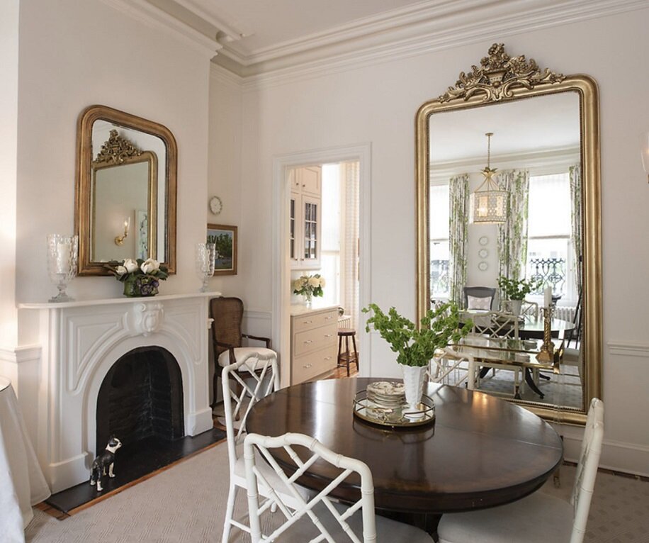
 By strategically and thoughtfully placing large mirrors, in this case a treasured family piece, we can make a room appear nearly twice as spacious. In this dining room, the large mirror served double duty, both increasing the perceived depth of the space, and reflecting the natural light from the windows, which also enhances the feeling of space. The smaller mirror over the mantel reflects artwork and captures the glow of the sconces on the opposite wall.
5) Get creative to make unexpected spots functional

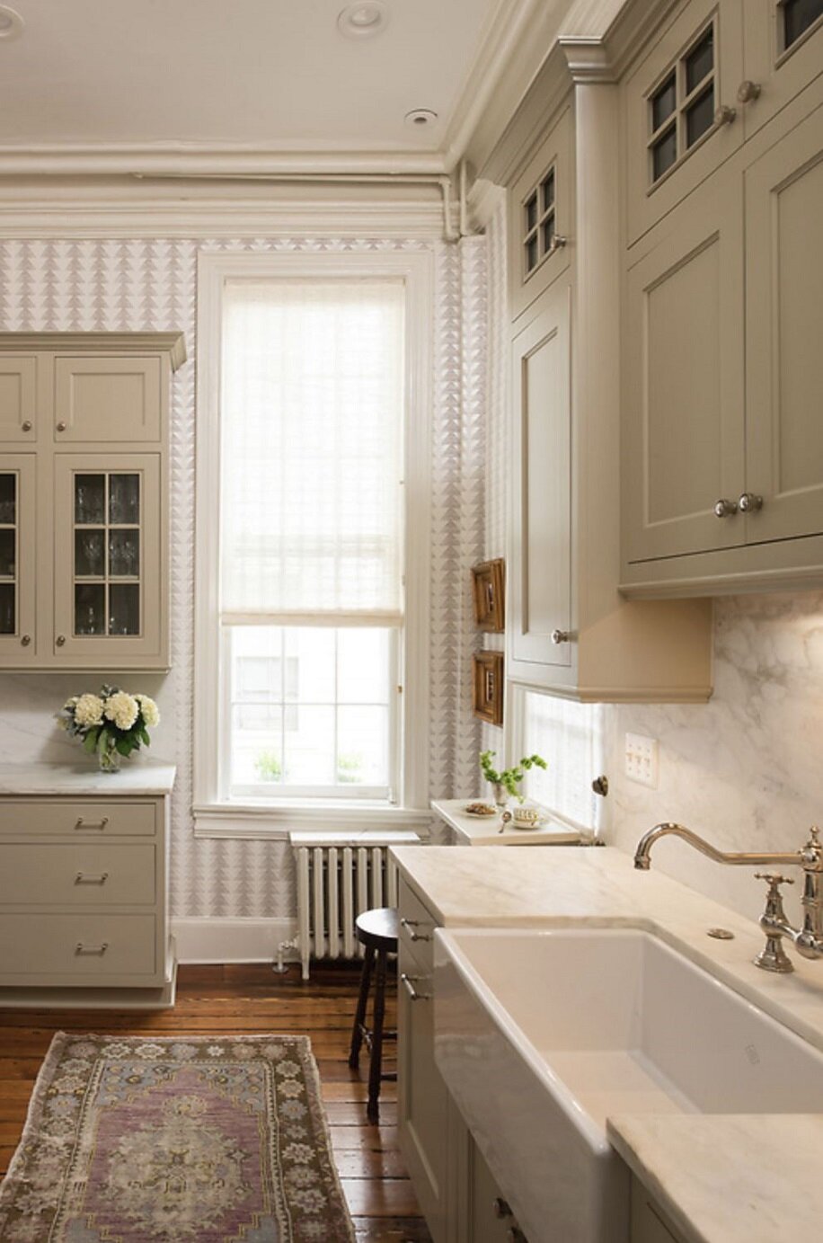
 Just because a space is tight, it doesn't mean there isn't a clever (and cute!) way to sneak in some function. Here, since everyone loves be in the kitchen anyway, we added a folding tray table to the back of a door. Instant coffee spot and homework station!
Have a small space design challenge? We'd love to help!
📸::Kevin Allen Photography

